Booking.com

Booking.com

Booking.com

Mobile App Redesign

Mobile App Redesign

Mobile App Redesign

Our team improved the app's design for a more user-friendly and visually appealing experience. We simplified the design, used a consistent color palette and typography, and added card elements for cohesion and intuition.

Our team improved the app's design for a more user-friendly and visually appealing experience. We simplified the design, used a consistent color palette and typography, and added card elements for cohesion and intuition.

Our team improved the app's design for a more user-friendly and visually appealing experience. We simplified the design, used a consistent color palette and typography, and added card elements for cohesion and intuition.

Team

Maria Iracli, Noam Bergmann

Role

UX/UI Designer

Tools

Figma

Duration

3 days

Deliverables

4 Redesigned Screens

01 INTRODUCTION

01 INTRODUCTION

01 INTRODUCTION

The Challenge

The scope of this project was to redesign 4 screens of an well-known app. Our design changes will not be limited to aesthetics but will also affect the usability of the product.

We have chosen Booking.com as the app to work on. Booking.com is a popular travel booking app that allows users to book flights, hotels, rental cars, and other travel-related services.

However, despite its popularity, the app has a reputation for being chaotic and inconsistent in terms of its user interface (UI) and user experience (UX). This inconsistency can lead to confusion and frustration among users, making it difficult for them to find what they’re looking for and complete their bookings quickly and efficiently.

02 RESEARCH

02 RESEARCH

02 RESEARCH

Cloning the App

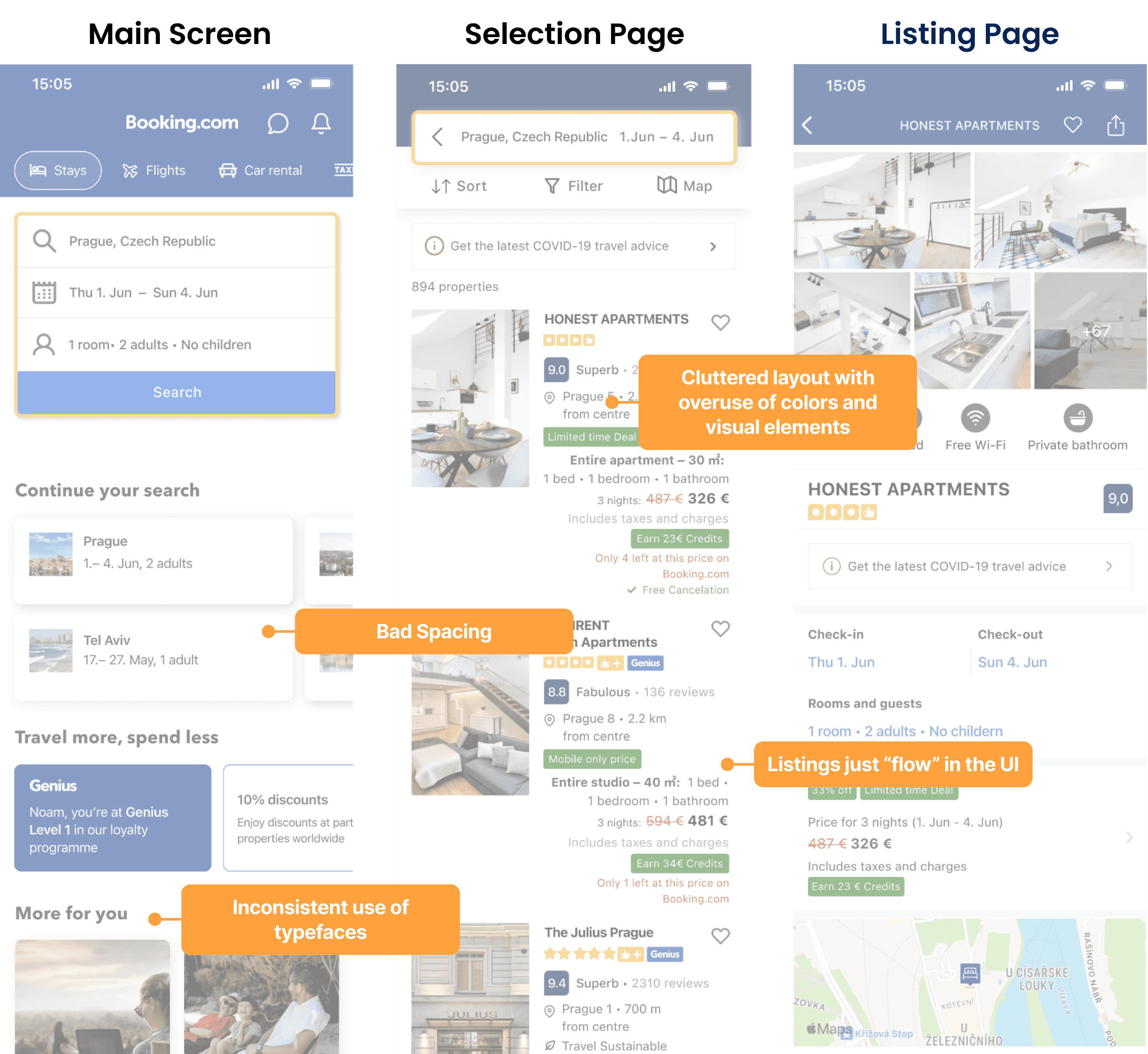
The first step was to clone four screens of the Booking.com app. The main objective of that task was to understand how the app was designed. We decided to focus on: the main screen, a listing selection page, a product page and a room selection page. To accomplish this, we conducted a thorough analysis of the original app’s design, including the color scheme, typography, and layout. During the process of cloning the screens, we observed that the first screen of the app utilized certain visual elements that were not present in the subsequent screens. Additionally, we noticed slight variations in color usage between the screens.

Heuristic Analysis

Based on our cloned screens we conducted a heuristic analysis, focusing on aesthetic and minimalistic design principles, and identified strengths and weaknesses of the Booking.com app. We observed inconsistencies in visual elements and color usage between screens during the cloning process. We could identify 2 main pain points: Inconsistency: Different elements of the app have inconsistent designs, it can confuse users and make it difficult for them to navigate. Cluttered Layout: A cluttered and overcrowded layout make it difficult for users to find what they are looking for and overwhelm them with too much information. The color palette appears a little outdated and could benefit from a more contemporary and refreshing look while staying within the branding color range. Interestingly the main screen of the app looked like it was designed in a completely different way from the rest. It had a modern design, with different visual elements and even a different typeface. To maintain consistency and cohesion, we drew inspiration from the first screen and incorporated its unique elements throughout the redesign process, resulting in a more unified and intuitive user experience across all screens.

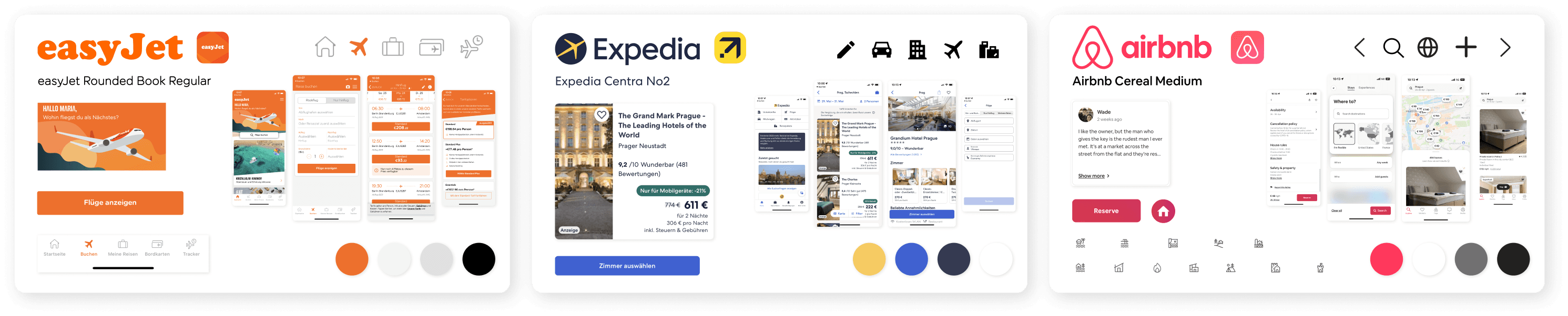
Visual Competitive Analysis
  • Prioritizing Essential Information: 


    EasyJet's clear and modern approach emphasizes presenting crucial information upfront, enhancing user satisfaction and ease of use.


  • Effective Information Hierarchy: 


    Expedia's design utilizes a fuller color palette and card-based layouts, improving information organization for a visually appealing and organized experience.


  • Limited Color Scheme and Simplified Layouts: 


    Airbnb and EasyJet's minimal color scheme and simplified layouts create a modern and airy feel for the Booking.com redesign.

Moodboard

After conducting heuristic and visual competitive analyses, we opted for a more minimalistic design that uses color thoughtfully. The analyses showed that the app's current design was cluttered and overwhelming, with too much information on each screen. Our goal was to appeal to users' desire for adventure and exploration by creating a more immersive and experiential design. We achieved this by using a calm, minimalist design with thoughtful color choices to make the user experience more engaging and enjoyable. The result was a more appealing and user-friendly app.

Colors & Typography

We created a new style tile with a modern, fresh look by updating the primary color to a more saturated tint of blue and pairing it with a vibrant shade of yellow. We kept a clean look with white space for the visual elements. We kept the original SF Pro typeface as it worked well for the app. Avenir was removed in favor of experimenting with SF Pro's different fonts to create a cohesive look. We saved the fonts as styles in our file for easy access.

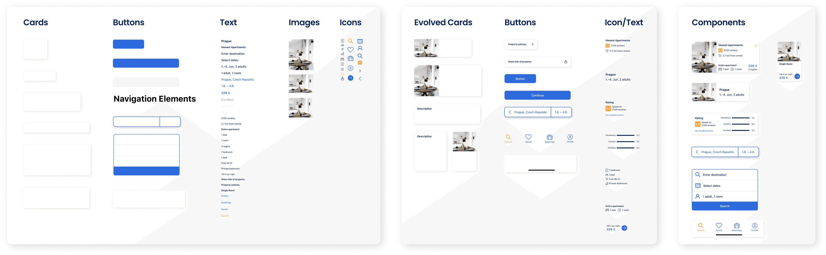
Atomic Design System

We organized all of our visual elements in an atomic design system to achieve consistency, scalability, and efficiency in our design process while promoting modular and reusable components.

04 SOLUTION

04 SOLUTION

04 SOLUTION

Prototype in action

This prototype showcases the user flow for searching, finding and selecting an accomodation.

This prototype showcases the user flow for searching, finding and selecting an accomodation.

This prototype showcases the user flow for searching, finding and selecting an accomodation.

Hi-Fi Wireframes

We made several updates to the design of the app to improve its user interface and therefore also usability and user experience:

  • We kept the home screen similar to the original but updated the colors and used typography more consistently throughout the design.


  • We updated the design of the cards with a bigger image and aligned text.


  • The Nav Bar now features our updated color palette, with our accent color being utilized to emphasize the user’s current location on the app.

We used card elements in a more cohesive way throughout the entire design.

  • When a user clicks on a destination, such as Prague, we made sure to display the most important information first. This allows the user to quickly scan through the proposed properties, and if they want to learn more, they can click on the card to see further details.

Once the users select a property, they are presented with images, additional information about the property, and can choose their desired room. 


  • Upon selecting their accommodation type, users will receive a visual confirmation through an animated micro interaction that displays the blue arrow transforming into a green check mark.

  • We moved that room selection element up on the page and incorporated it into the same screen. On this way we could shorten the entire page drastically and even omit the second screen. Originally, proceeding to the room selection was at the bottom of the page and required the user to navigate to another page to make their selection.

We simplified the design, used a consistent color palette and typography, and added card elements for cohesion and intuition. Users can now quickly scan through proposed properties and make more informed decisions. We reduced the number of clicks required to make a booking, improving the efficiency and user-friendliness of the app. These updates have improved the overall user experience, making the app more enjoyable to use and increasing the chances that users will book their accommodations through this app.

We simplified the design, used a consistent color palette and typography, and added card elements for cohesion and intuition. Users can now quickly scan through proposed properties and make more informed decisions. We reduced the number of clicks required to make a booking, improving the efficiency and user-friendliness of the app. These updates have improved the overall user experience, making the app more enjoyable to use and increasing the chances that users will book their accommodations through this app.

We simplified the design, used a consistent color palette and typography, and added card elements for cohesion and intuition. Users can now quickly scan through proposed properties and make more informed decisions. We reduced the number of clicks required to make a booking, improving the efficiency and user-friendliness of the app. These updates have improved the overall user experience, making the app more enjoyable to use and increasing the chances that users will book their accommodations through this app.

I create seamless experiences that blend beauty and functionality.

I create seamless experiences that blend beauty and functionality.

I create seamless experiences that blend beauty and functionality.