Wundertax

Wundertax

Wundertax

Tax Declaration Form Redesign

Tax Declaration Form Redesign

Tax Declaration Form Redesign

We partnered with the Berlin-based start-up, wundertax, which provides a service to simplify the tax process. During usability testing of their existing system, we identified several other issues. As a result, we redesigned their tax declaration form by improving the information hierarchy and introducing new features. This project got awarded for the "Best UX/Most user-centered solution" amongst all projects in the UX/UI Design March 23 Remote Cohort from Ironhack.

We partnered with the Berlin-based start-up, wundertax, which provides a service to simplify the tax process. During usability testing of their existing system, we identified several other issues. As a result, we redesigned their tax declaration form by improving the information hierarchy and introducing new features. This project got awarded for the "Best UX/Most user-centered solution" amongst all projects in the UX/UI Design March 23 Remote Cohort from Ironhack.

We partnered with the Berlin-based start-up, wundertax, which provides a service to simplify the tax process. During usability testing of their existing system, we identified several other issues. As a result, we redesigned their tax declaration form by improving the information hierarchy and introducing new features. This project got awarded for the "Best UX/Most user-centered solution" amongst all projects in the UX/UI Design March 23 Remote Cohort from Ironhack.

Team

Maria Iracli, Anaëlle Damien, Di' André Luster

Role

UX/UI Designer

Tools

Figma, Figjam

Duration

8 days

Deliverables

Redesigned Form

Dashboard Sidebar Close Up

01 INTRODUCTION

01 INTRODUCTION

01 INTRODUCTION

The Challenge

Initially, our task was to incorporate a new user flow. However, during usability testing of their existing system, we identified several other issues. As a result, we conducted UX research and redesigned the tax declaration form by improving the information hierarchy and introducing new features.

02 EMPATHIZE

02 EMPATHIZE

02 EMPATHIZE

Market Research

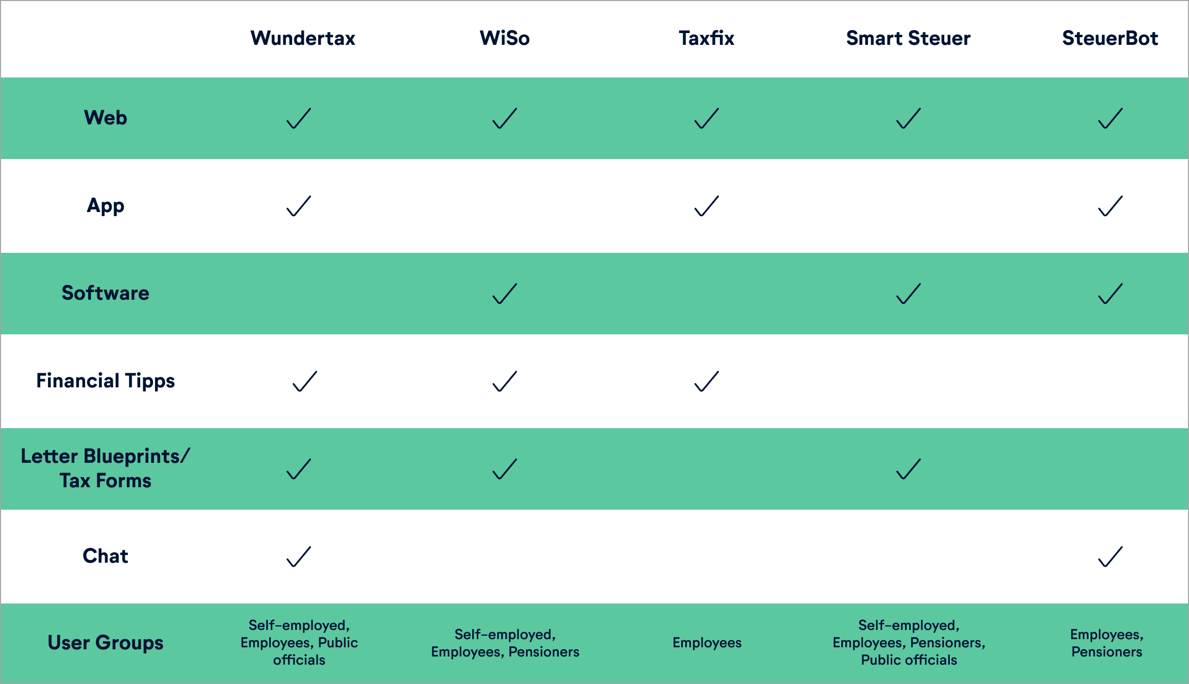
To better understand the competitive landscape, we conducted a thorough competitor analysis. Through this analysis, we discovered that Wundertax sets itself apart from its competitors by offering a wide range of features to its users. These features include web and mobile applications, valuable tips, and a chat function. These additional offerings enhance the user experience and set Wundertax apart in the market.

Full Dashboard
Full Dashboard
Full Dashboard

Usability Testing

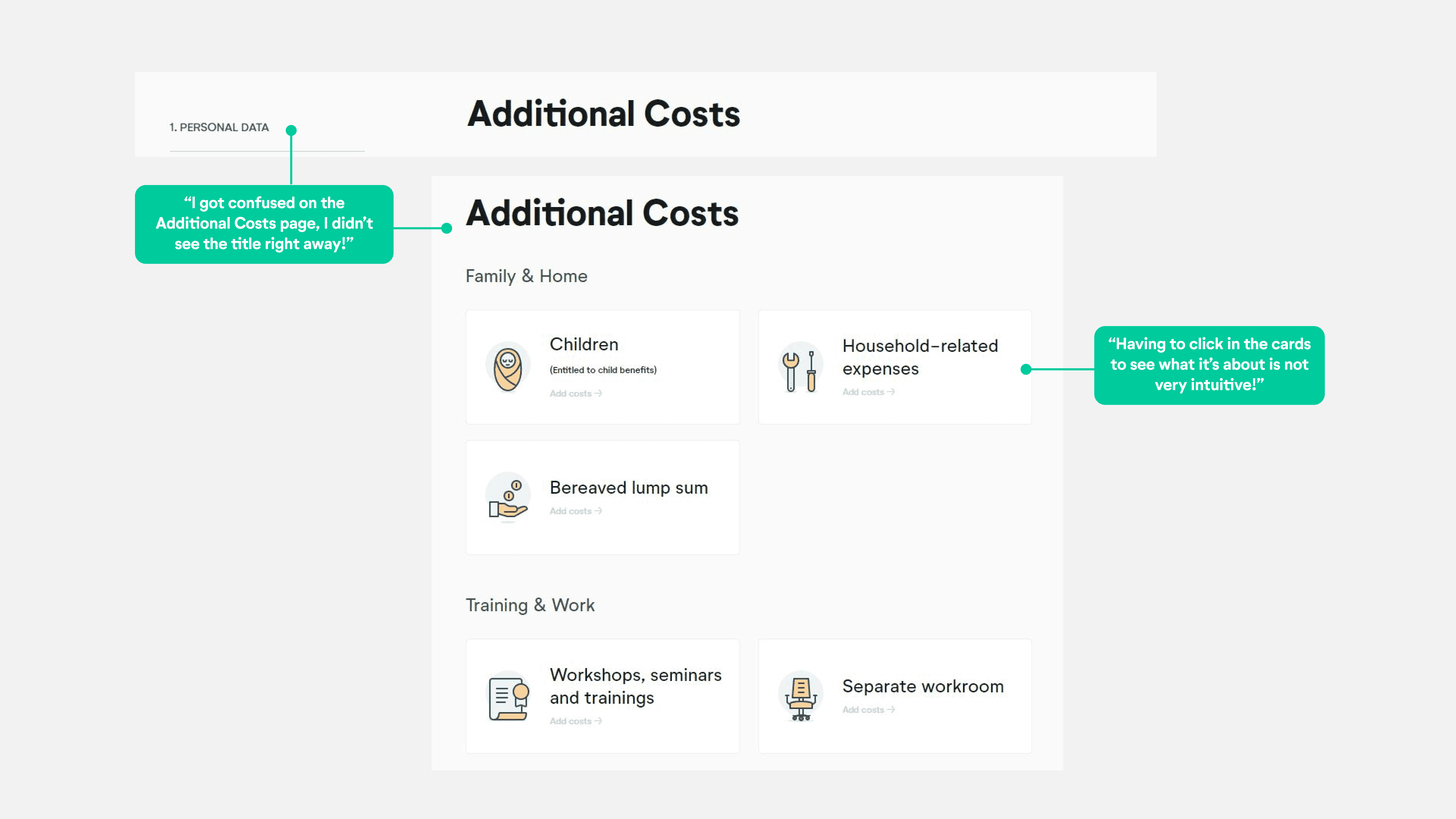
In order to identify issues and pain points experienced by users, as well as to examine our initial assumptions regarding UX and UI irregularities, we conducted usability testing on the current website. This testing also aimed to uncover the features that users appreciate, so we would know which features to keep. Additionally, we conducted interviews with our testers, gathering information about their demographics and preferences. By testing individuals unfamiliar with Wundertax services, we obtained unbiased feedback and fresh insights, ensuring objective opinions based solely on interface interaction and avoiding bias from preconceived notions or prior experiences, resulting in accurate and valuable data for design improvements.
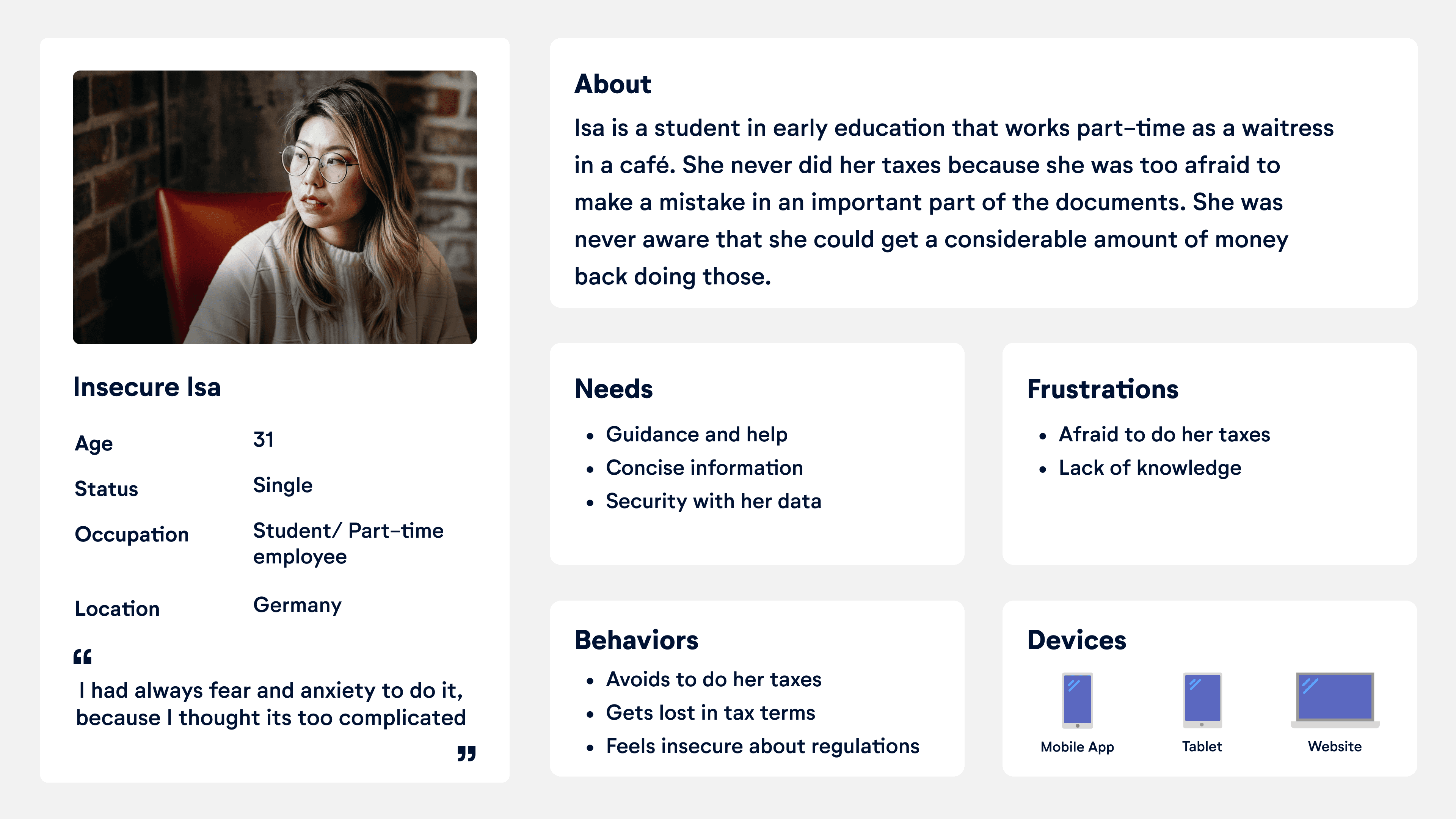
Persona

User Journey Map

Isa, a first-time user of the Wundertax web application, initially feels concerned about filing her taxes due to lack of knowledge. As she progresses through the personal data page, her confidence increases as she finds it easy to use. However, she faces difficulties and feels stuck on the commute section, highlighting the need for clearer navigation. Isa also experiences confusion regarding the functionality of buttons on the site, particularly in terms of saving changes and understanding their outcomes. Despite these challenges, Isa successfully completes the form, ultimately feeling happy and accomplished despite occasional confusion throughout the process. Though some opportunities arised along the way, that we phrased onto How Might We Statements: - HMW help her understand that she can save her changes? - HMW help her to understand what will happen when she clicks a button on the site?

Full Dashboard with Sidebar

Problem Statement

Wundertax was designed to achieve an autonomous and accessible way of submitting tax declarations. We have observed that the form is not meeting the user’s need of an information hierarchy which is causing difficulties navigating the website and a decrease in conversion rates to the business.

04 IDEATION

04 IDEATION

04 IDEATION

Crazy 8's

Once we had our problem statement we used the insights from the usability testings and interviews to identify the main pain points and translate them into possible solutions. These first ideas were essential for the creation of the following low fidelity (lo-fi) screens and prototypes.

Lo-Fi

We made several design decisions to improve the user experience of our interface:

  • We placed the calculator at the top of the navigation bar because it's more coherent with the way users read from left to right.

  • Following the same guide, we positioned the save button at the bottom of the navbar instead of the very bottom of the page.

  • We took care to align the title of the page with the navbar to make it more noticeable and create a natural experience for our users.

  • To maintain a natural flow for users, we placed all the "save and continue" buttons at the bottom of the form.

  • Lastly, we put the payment information in a box to ensure it's as noticeable as the rest of the content, as it leads users to the rest of the process.


    Overall, we have considered user experience and visual hierarchy when making these design choices, aiming to create a more coherent and intuitive interface for our users.

Iterations & Usability Testing on Mid-Fi

We made several modifications to our Mid-fi prototype based on testing with both the client and potential users. Here are the key changes we implemented:

  • We adjusted the spacing between different components of the navbar to emphasize that they are separate elements.


We made several modifications to our Mid-fi prototype based on testing with both the client and potential users. Here are the key changes we implemented:

  • We adjusted the spacing between different components of the navbar to emphasize that they are separate elements.


We made several modifications to our Mid-fi prototype based on testing with both the client and potential users. Here are the key changes we implemented:

  • We adjusted the spacing between different components of the navbar to emphasize that they are separate elements.


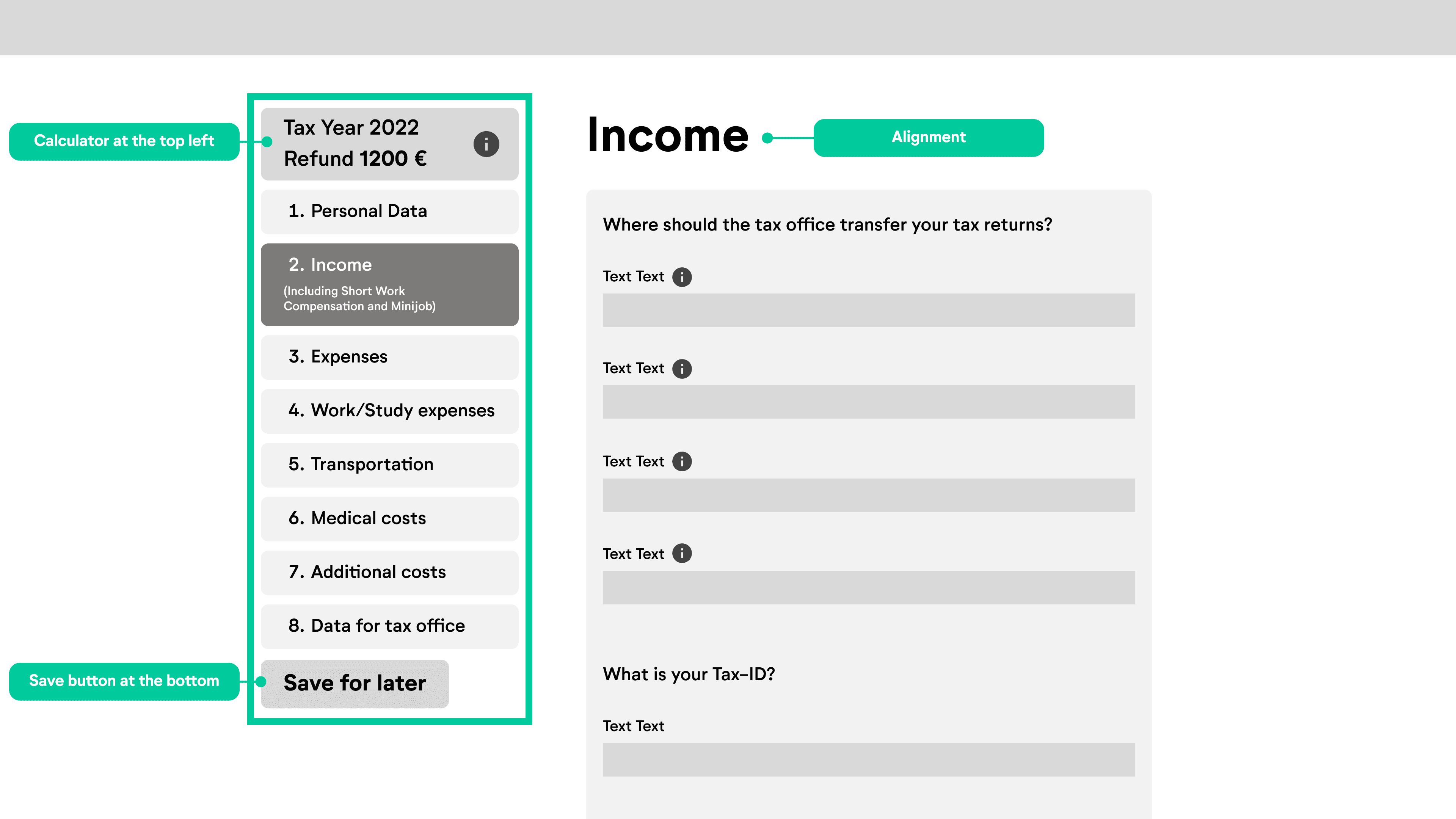
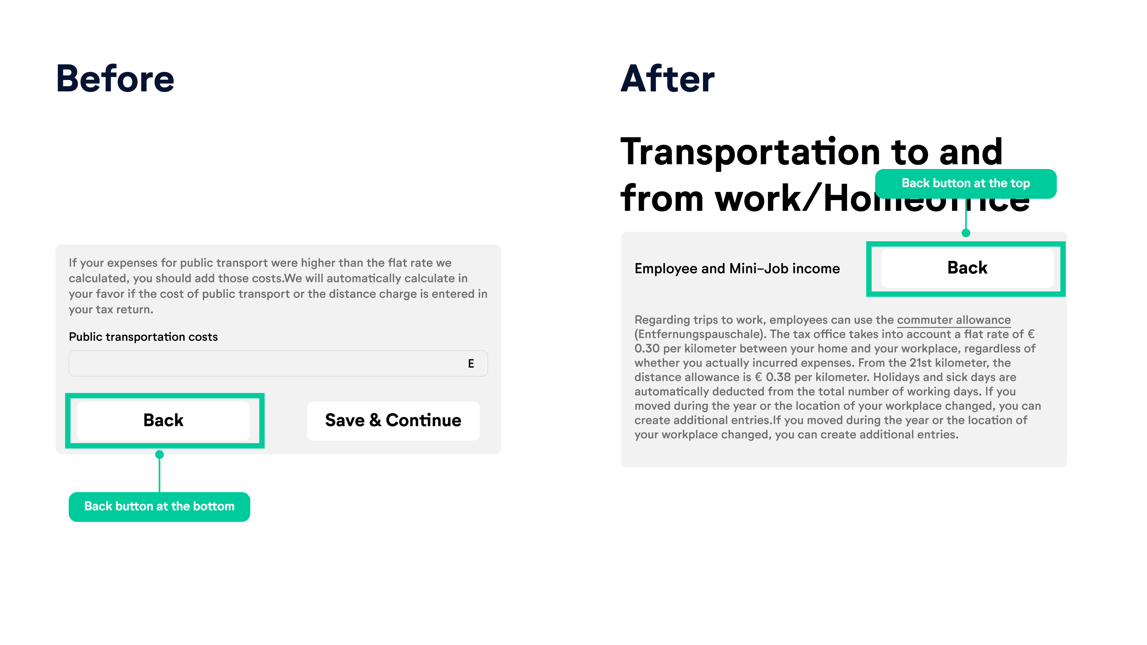
  • Following our client's suggestion, we removed the "hint" since it became unnecessary with the color-coded text.-

  • After reconsidering, we placed the back button back on top. This change prevents users from having to scroll through the entire page if they accidentally landed there and simply want to skip that part.

  • After reconsidering, we placed the back button back on top. This change prevents users from having to scroll through the entire page if they accidentally landed there and simply want to skip that part.

  • After reconsidering, we placed the back button back on top. This change prevents users from having to scroll through the entire page if they accidentally landed there and simply want to skip that part.

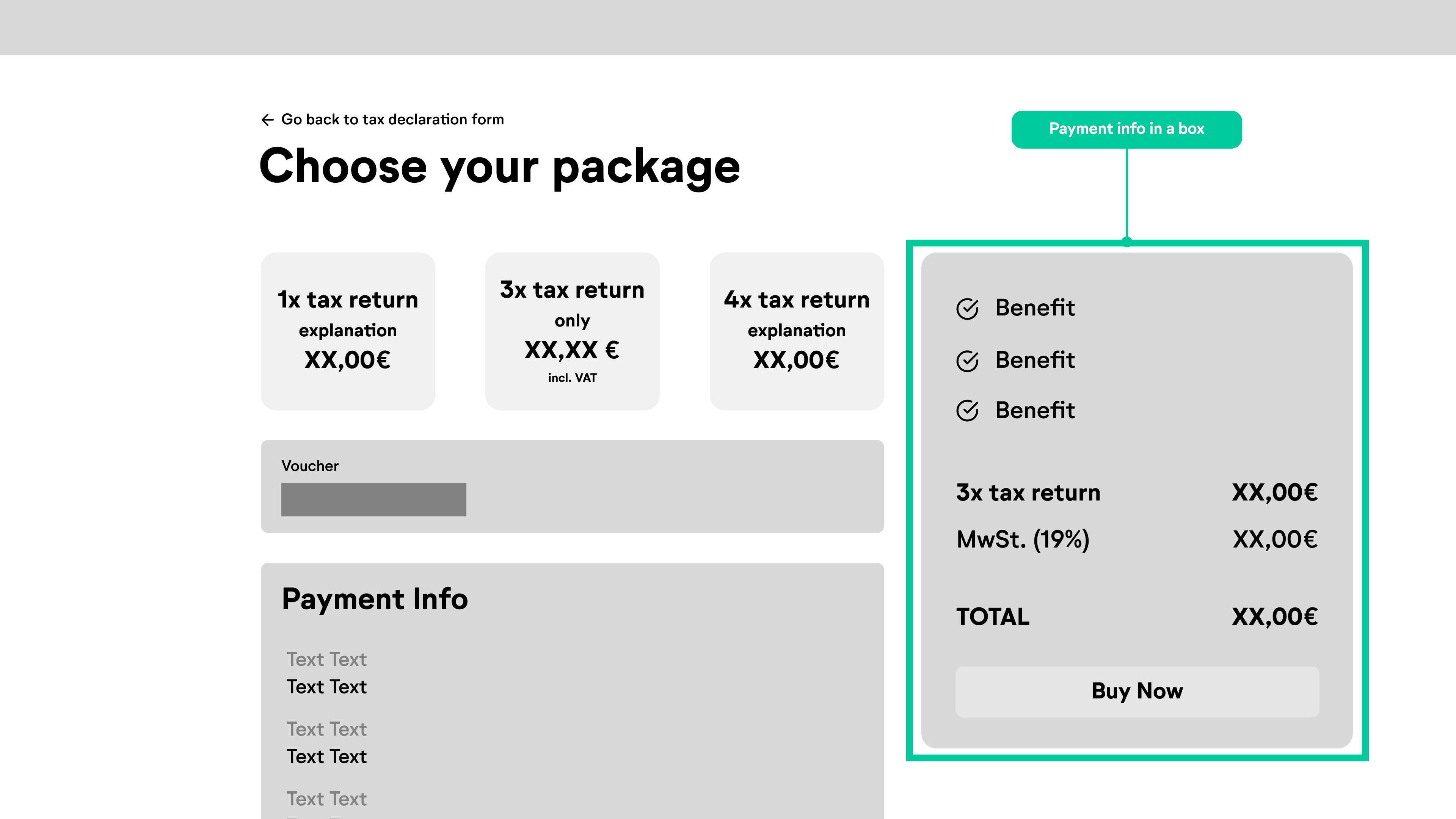
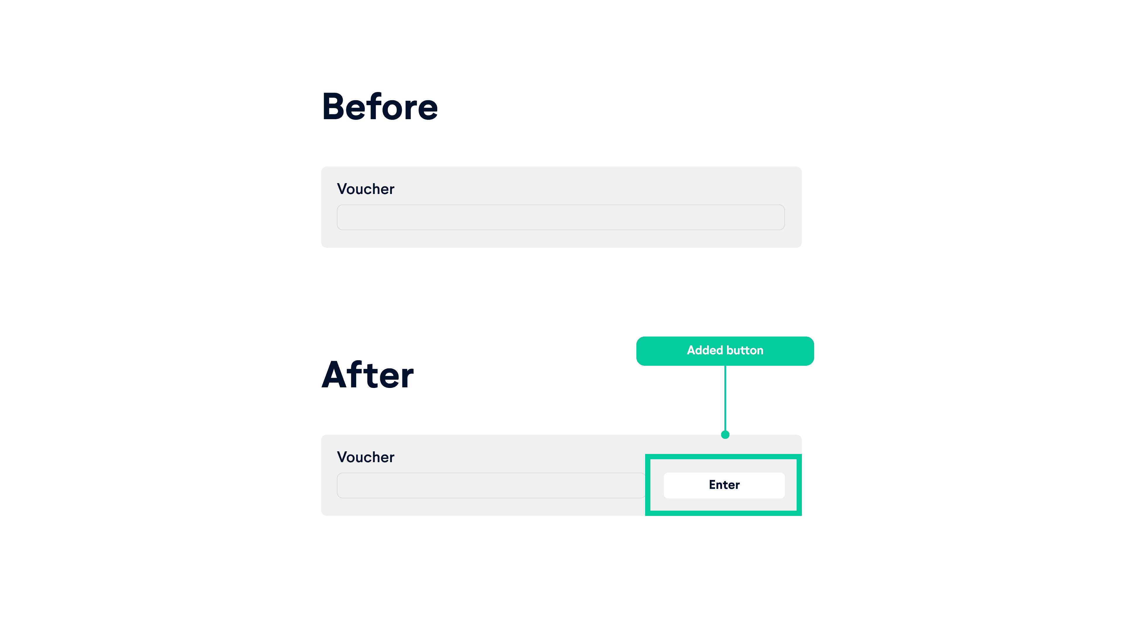
  • We added a voucher button to maintain consistency throughout the screens. By this point, users are accustomed to seeing buttons, and removing it could cause confusion.

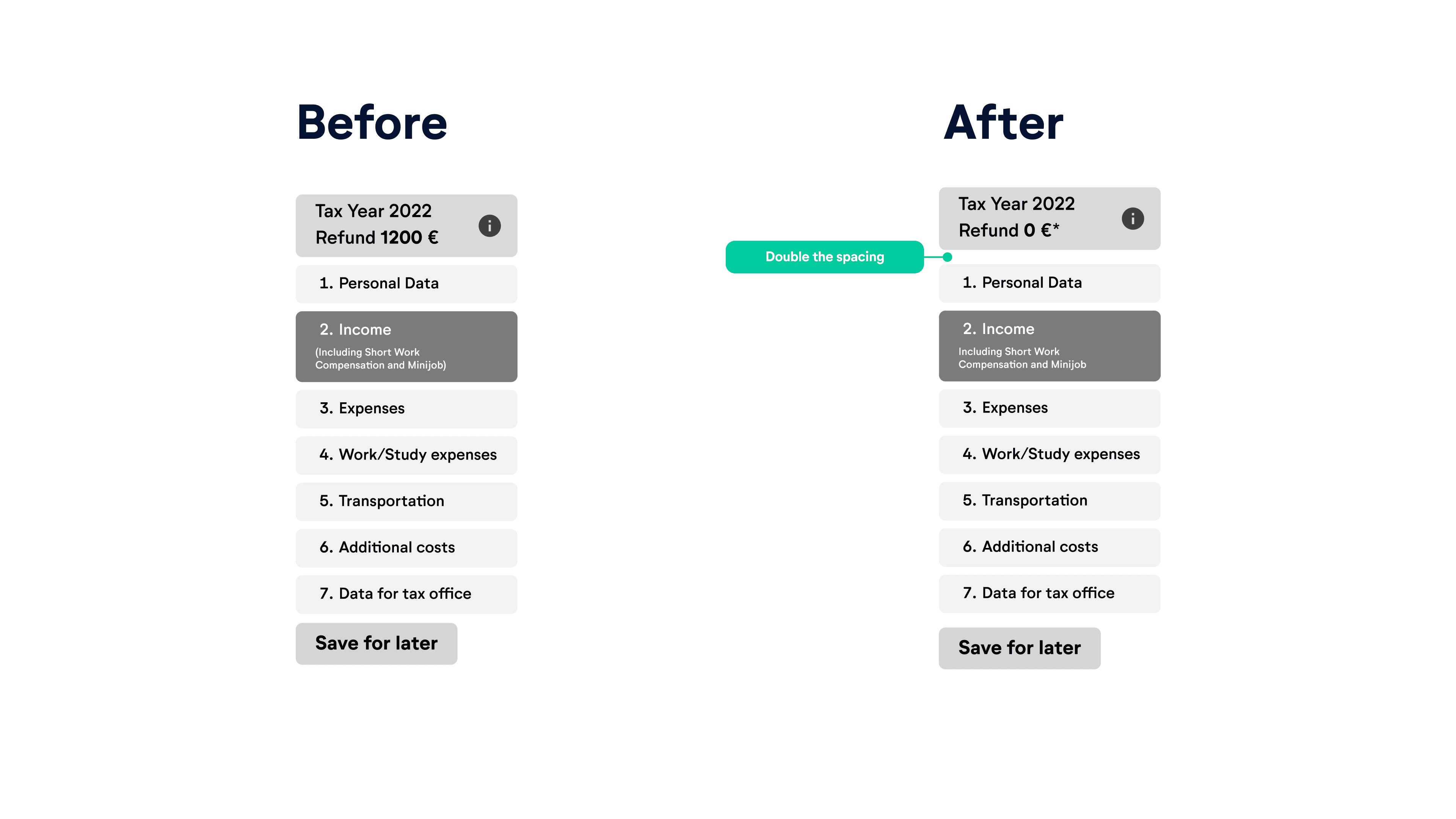
  • In our Hi-fi prototype, we significantly revised the page that appears after payment, as it was causing confusion. In the Mid-fi version, we changed the page's title to convey to users that they are close to achieving their goal but still have a few steps remaining.

    These modifications were based on valuable feedback from testing, allowing us to enhance the user experience and address potential usability issues.

05 BRANDING

05 BRANDING

05 BRANDING

Visual Competitor Analysis

We compared three different brands based on their visual approach. Here is a summary of the findings:


Tax Fix


  • Visual Style: Minimalistic design

  • User Interface: Presents one input field at a time

  • Impression: The minimalistic design suggests simplicity and focus, appealing to users seeking a straightforward and uncluttered experience.


WiSO Steuer


  • Visual Style: Colorful design

  • User Interface: Traditional approach

  • Impression: The colorful design implies vibrancy and energy, but the traditional approach may give it an outdated feeling, potentially not resonating well with users looking for a modern and innovative solution.

Steuerbot


  • Visual Style: Reduced, limited color palette

  • User Interface: Chat-based interaction

  • Impression: The reduced use of colors and chat-based interaction creates a conversational and approachable experience. This approach is well-suited for users who prefer a guided and extremely simplified process.

05 BRANDING

05 BRANDING

05 BRANDING

Moodboard & Brand Attributes

We visualized the brand attributes, which we also modified to the ones from the brand to match with our redesign. The branding gives now a fast, efficient, trustworthy and secure feeling to the users.

Style Tile

We incorporated the brand's new color palette and typefaces provided by the client, which combine a modern look with elements of traditional form, creating a harmonious fusion of both styles. To establish an effective information hierarchy, we implemented the use of cards and color-coded them to visually organize and prioritize information. This approach enhances user experience by providing a visually appealing and structured interface.

Desirability Testing

We tested the desirability by presenting some screens to different people and our results very pretty much matching with out initial brand attributes.

06 SOLUTION

06 SOLUTION

06 SOLUTION

Prototype in action

This prototype video shows the user flow of completing a tax declaration form and submitting it. In addition to the improved information architecture, we have incorporated several new features and micro interactions.

Clicklable Prototype

Try out the Figma prototype yourself directly here! Make sure to switch to full screen on the top right corner for a better experience. If you have difficulties you can also view the prototype here.

The next step of this project would involve conducting A/B testing between the existing website and the new prototype, followed by iterations and eventually implementing the new solutions. Our ability to adapt to unforeseen challenges and pivot our strategies to address the genuine needs of the users has been key to the success of this project. These valuable lessons have equipped us with the necessary skills to navigate future inconveniences and ensure the continued improvement and satisfaction of our users.

The next step of this project would involve conducting A/B testing between the existing website and the new prototype, followed by iterations and eventually implementing the new solutions. Our ability to adapt to unforeseen challenges and pivot our strategies to address the genuine needs of the users has been key to the success of this project. These valuable lessons have equipped us with the necessary skills to navigate future inconveniences and ensure the continued improvement and satisfaction of our users.

The next step of this project would involve conducting A/B testing between the existing website and the new prototype, followed by iterations and eventually implementing the new solutions. Our ability to adapt to unforeseen challenges and pivot our strategies to address the genuine needs of the users has been key to the success of this project. These valuable lessons have equipped us with the necessary skills to navigate future inconveniences and ensure the continued improvement and satisfaction of our users.

I create seamless experiences that blend beauty and functionality.

I create seamless experiences that blend beauty and functionality.

I create seamless experiences that blend beauty and functionality.